 Log in

|
Sr. Content Developer at Microsoft, working remotely in PA, TechBash conference organizer, former Microsoft MVP, Husband, Dad and Geek.
|

Pennsylvania, USA


TL;DR: JavaScript PDF viewers often fail to render fillable forms correctly, resulting in missing fields, broken layouts, and data loss. This guide demonstrates how to resolve these issues and create interactive PDF forms with dynamic fields and validation.
Building e-signature workflows, tax portals, HR onboarding systems, or surveys often depends on PDF form fields. Text inputs, dropdowns, checkboxes, and signature fields make PDFs editable, allowing users to complete documents directly in the browser. When you create fillable PDF forms from templates or generate them dynamically, a JavaScript PDF viewer ensure a smooth user experience.
However, this is where challenges arise. Developers frequently report issues with JavaScript PDF form fields, such as fields not rendering, layout shifts, incorrect checkbox states, or data disappearing after saving. These problems make it hard to validate and export accurate results.
This guide explains why these issues occur and how to fix them. You’ll learn how to read and fill PDF form fields accurately, and export clean results using the Syncfusion JavaScript PDF Viewer.
Why do JavaScript PDF Form Fields fail?
Based on developer feedback from forums and GitHub, here are the most common pain points:
- Missing interactive fields
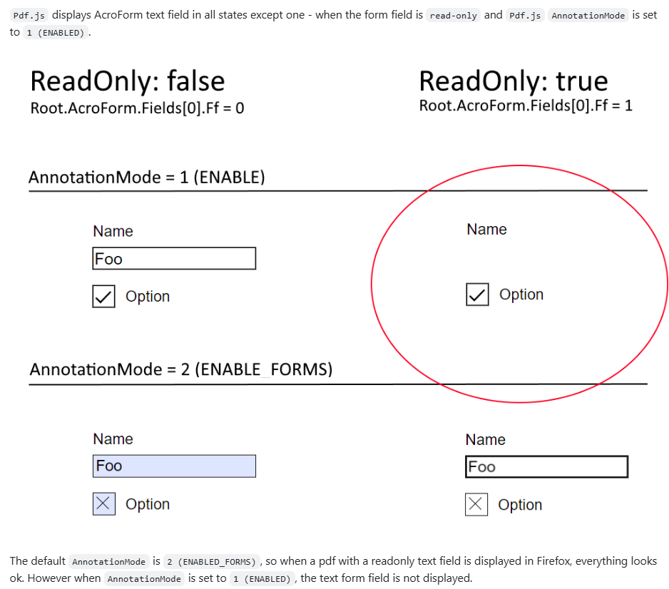
Many PDF viewers default to a flattened mode, turning form fields into static content or hiding them completely.PDF Form Field Contents not displayed — User on StackOverflow, Issue
Filled in Form Fields not displaying — User on GitHub, Issue #6457 - Hidden configuration requirements
Enabling interactive forms often requires specific settings that developers overlook, leading to confusion about missing features.Read only form field not rendered when AnnotationMode = 1 (ENABLED)
— User on GitHub, Issue #17064
- Incorrect appearance and data loss: Checkboxes, radio buttons, and custom symbols often render incorrectly. Even worse, field states like a checked box may vanish after saving.
Some PDF Textfield content not visible until clicked
— User on StackOverflow, Issue
[Bug]: Broken PDF fields on form
— User on GitHub, Issue #19274 - Visual glitches and performance issues: In modern frameworks like React, complex form rendering can cause flickering, slow performance, or broken layouts.
- Inconsistent browser behavior: Built-in PDF viewers in browsers like Chrome or Firefox offer limited and unpredictable support for interactive forms.
pdf.js viewer does not support the JavaScript under button on PDF. JavaScript functions does not work properly
— User on GitHub, Issue #14708
- Data not recognized: Users fill out forms, but the underlying library fails to save or export the data. The result? A blank PDF after download or print.
Form fields rendering as transparent with jsPDF
— User on StackOverflow, Issue
- Limited AcroForms and XFA support: Most lightweight viewers support AcroForms partially and ignore XFA entirely, leaving developers puzzled when some forms work, and others don’t.
[AskJS] Is it possible to fill a pdf form using JavaScript?
— User on Reddit, Issue
These failures frustrate users and defeat the purpose of a web-based PDF viewer, forcing them back to desktop apps.
Why PDF Form Field issues persist in JavaScript Web Viewer
These problems aren’t due to a lack of effort; they stem from technical complexity hidden in the PDF specification and browser architecture. Most open-source and browser-native viewers were never designed to handle this level of interactivity.
Here’s why these issues persist:
1. Interactive form rendering isn’t a priority
Most open-source viewers focus on static document appearance, treating interactive forms as optional. As a result, developers face under-recognized issues because interactivity takes a back seat.
2. PDF form specification is complex
The PDF standard supports advanced features like custom appearances, validation logic, and calculation scripts (AcroForms/XFA). Lightweight libraries avoid this complexity, which leads to failures with common business documents that require robust handling.
3. Canvas rendering vs. interactive DOM
Most viewers render PDFs on a <canvas> element, a flat image with no concept of interactive elements. They build fragile interaction layers to simulate clicks and inputs, which can cause glitches, flickering, and data entry failures.
5. Dependency on browser-native viewers
Built-in PDF engines in browsers like Chrome and Firefox handle interactive forms inconsistently. These viewers aren’t designed as reliable, embeddable components, leaving developers with no way to debug or fix rendering issues.
A robust solution to Fillable PDF Forms in JavaScript
If you’ve struggled with missing fields, broken layouts, or data loss in PDF forms, you’re not alone. Most lightweight viewers fall short when handling interactive forms. The good news? A well-designed Syncfusion JavaScript PDF Viewer can solve these challenges and give developers complete control over form rendering and data handling.
Note: For a comprehensive walkthrough, refer to the user guides to learn how to create and design your form.
Here’s what a robust solution should offer:
1. Complete acro forms support
Syncfusion PDF Viewer provides comprehensive support for Acro Forms, ensuring seamless compatibility with standard PDF form structures.
2. Wide range of form fields
Syncfusion JS PDF Viewer offers support for Textbox, Password, CheckBox, RadioButton, ListBox, DropDown, SignatureField and InitialField, everything you need for dynamic forms.
3. XFA and flexible data formats
Supports exporting and importing form field data in multiple formats, including JSON, JavaScript objects, FDF, and XFDF. This ensures flexibility when working with different data sources.
Note: Want the full walkthrough? Explore the import/export form fields guide.
4. Rich API for form events
PDF Viewer offers a comprehensive set of events to handle operations like adding, editing, moving, resizing, and customizing fields programmatically. This gives developers precise control over form behavior.
5. Built-in toolbar support for form design
The PDF viewer includes a toolbar with options to add new form fields, edit existing fields, remove fields, perform clipboard operations, and manage field layout.
6. Programmatic form field creation:
A rich API set is available for creating, updating, and customizing form fields programmatically, offering complete control to developers. Explore its detailed API section to know more about programmatic form field creation.
7. Field visibility and read-only options
Hide fields or make them read-only to control user interaction and maintain data integrity.
8. Form field validation
Built-in form-fields validation options help ensure accurate data entry and enforce input rules.
9. Dynamic field addition
Fields can be added on-the-fly during runtime, enabling highly interactive and responsive PDF forms to ensure performance.
10. Flexible appearance customization
Style fields with custom colors, borders, fonts, and sizes to match your application’s design.
11. Modular feature loading
Load only what you need to improve performance and reduce bundle size for large documents.
Creating and managing fillable PDF Forms with Syncfusion
Syncfusion’s JavaScript PDF Viewer offers a built-in toolbar. Developers can also dynamically add, fill, update, or remove form fields using intuitive APIs such as addFormField, updateFormField, and deleteFormField.
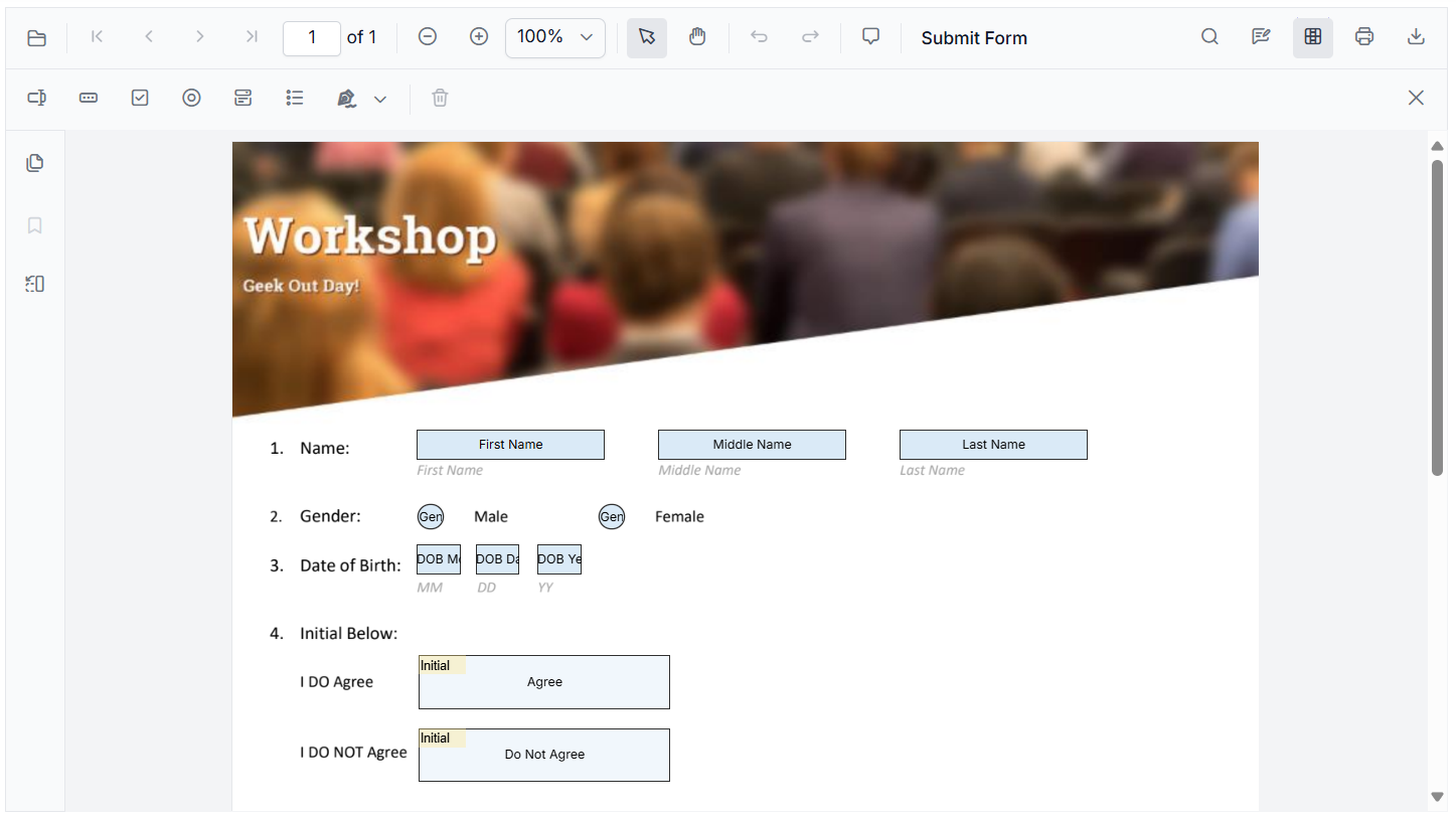
Add new form fields
Use the Form Design toolbar to insert fields like TextBox, CheckBox, and more with just a click, as shown below.
Prefer code? The addFormField API enables you to create fields programmatically by specifying the field type and its properties. Here’s an example of adding a TextBox field.
//Initialize PDF viewer with PDF document path and required syncfusion resources
var pdfviewer = new ej.pdfviewer.PdfViewer({
    documentPath: 'https://cdn.syncfusion.com/content/pdf/form-designer.pdf',
    resourceUrl:'https://cdn.syncfusion.com/ej2/31.1.17/dist/ej2-pdfviewer-lib'
});
//Adding textbox form field
pdfviewer.documentLoad = function (args) {
pdfviewer.formDesignerModule.addFormField("Textbox", { name: "Name", value : none
bounds: { X: 146, Y: 229, Width: 150, Height: 24 } });
}
Note: Ready to create your own forms? Step into our user documentation for step-by-step guidance on creating form fields programmatically! Explore our live demo and experience how easy it is to add fields using the built-in toolbar.
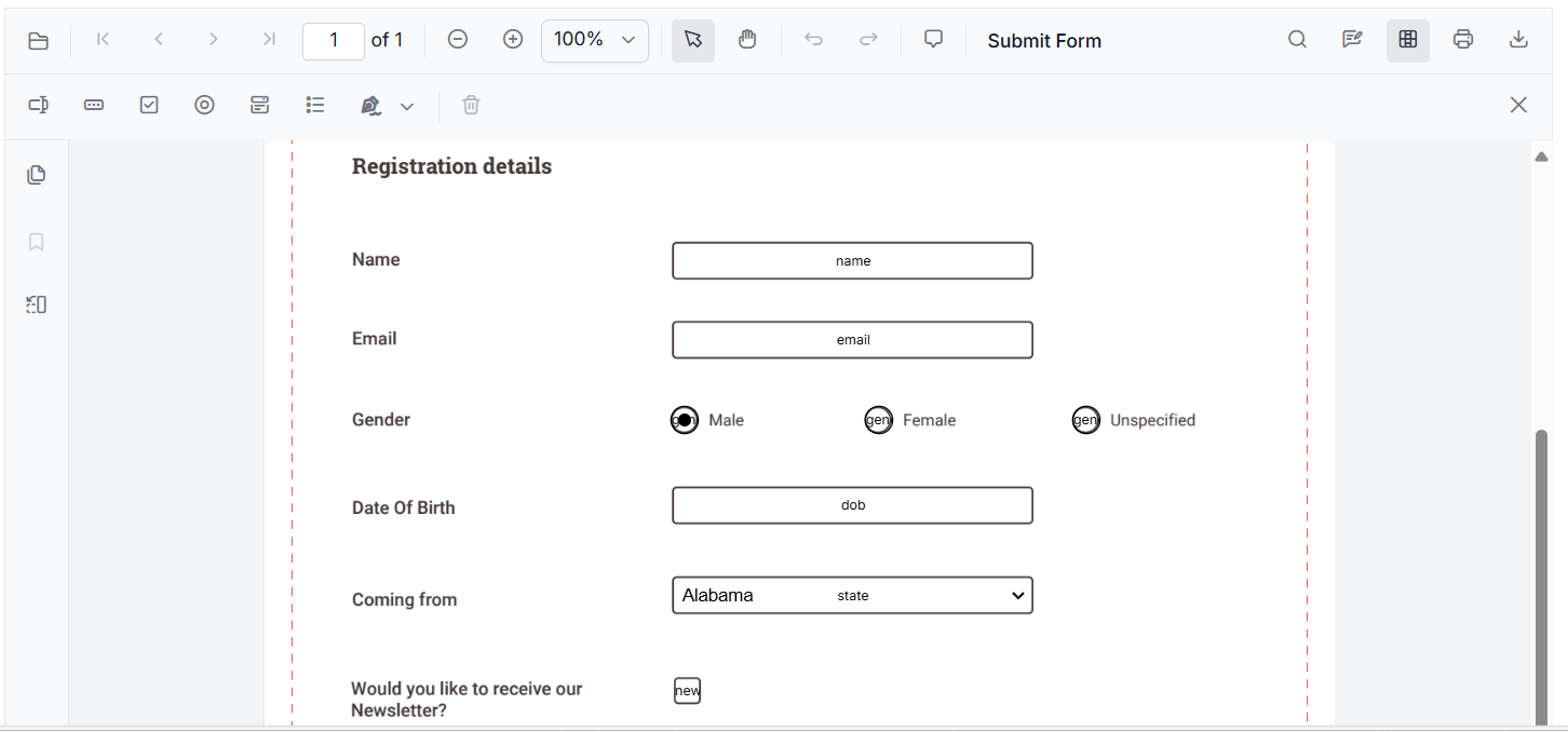
Customize existing form fields
Double-clicking any form field to open its properties panel or use the context menu for quick edits.

Programmatically, the updateFormField API lets you change appearance and behavior. Use the formFieldCollections property to get the field object or its ID. For example:
// Customize properties of the first TextBox form field
pdfviewer.formDesignerModule.updateFormField(pdfviewer.formFieldCollections[0], {
    fontSize: 12,              // Set font size
    backgroundColor: 'white',  // Set background color
    isMultiline: true          // Enable multiline behavior
    // You can customize additional properties as needed
});
Note: You can check our live demo and user guide to see how easily you can adjust fields using the built-in toolbar.
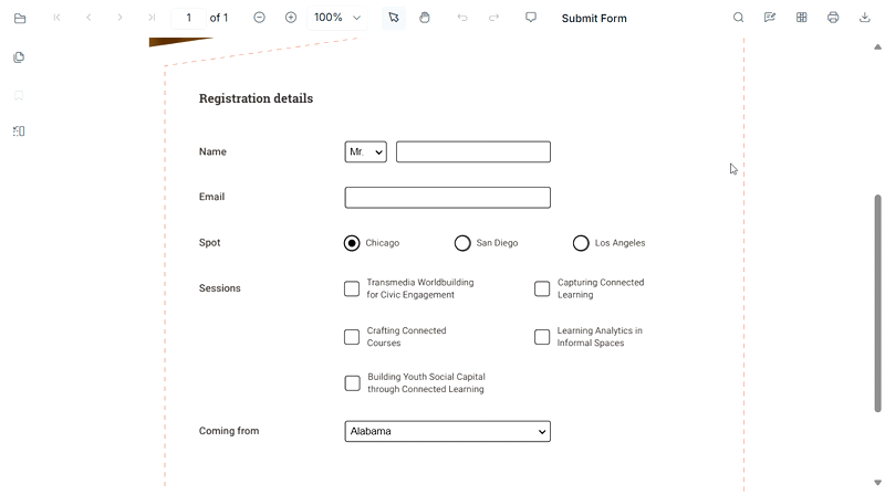
Delete form fields
Remove fields instantly using the delete icon on the toolbar or the context menu.
To delete via code, use the deleteFormField method, as shown below.
//Deleting first TextBox form field
pdfviewer.formDesignerModule.deleteFormField(pdfviewer.formFieldCollections[0]);
Note: For a detailed walkthrough on creating and modifying other form fields, refer to the user guide and live demo section.
FAQs
1. Does the Syncfusion JavaScript PDF Viewer fully support interactive PDF form fields?
Yes. Syncfusion provides complete support for AcroForms, including textboxes, dropdowns, checkboxes, radio buttons, signatures, list boxes, and more. It accurately renders, fills, edits, and exports form data without losing field states.
2. Can Syncfusion handle advanced PDF form types like XFA forms?
While most JavaScript PDF viewers ignore XFA entirely, Syncfusion supports working with form data formats such as JSON, FDF, and XFDF, giving developers extensive flexibility in importing and exporting form field values.
3. Does the Syncfusion PDF Viewer has support to create form fields programmatically?
Yes. Developers can dynamically create fields using APIs such as addFormField, updateFormField, and deleteFormField. This includes full control over size, style, position, and behavior.
4. Is there a UI-based form designer available in Syncfusion’s JS PDF Viewer?
Absolutely. Syncfusion includes a built‑in Form Designer toolbar that allows users to insert, edit, resize, delete, and customize form fields directly in the viewer without writing and struggling with code.
5. What form field events does Syncfusion support?
Syncfusion provides a rich event system for form operations such as adding, moving, resizing, selecting, validating, and customizing fields, giving developers full control over interactivity.
6. How does Syncfusion handle saving or exporting filled PDF forms?
It supports exporting to multiple formats including JSON, FDF, XFDF, ensuring no data loss. This solves the common problem where other viewers produce blank or partially filled PDFs after saving.
7. Can Syncfusion prevent accidental editing by making fields read‑only or hidden?
Yes. Syncfusion allows fields to be marked as read‑only or hidden, enabling secure, controlled user interactions.
8. Can I integrate Syncfusion PDF Viewer into workflows like onboarding, tax forms, or e‑signatures?
Yes. Syncfusion’s robust field support, validation features, and import/export capabilities make it ideal for workflows requiring accurate form handling such as HR onboarding, legal forms, surveys, invoices, and application forms.
Conclusion
Thank you for reading! Working with form fields in JavaScript PDF viewers often presents challenges, including limited customization options, a lack of dynamic behavior, inconsistent rendering, and complex validation logic.
Syncfusion JavaScript PDF Viewer addresses these challenges with:
- Dynamic field creation and editing
- Built-in validation
- Export/import in multiple formats (JSON, FDF, XFDF)
- Rich APIs for complete control
Whether you’re building e-signature workflows, tax portals, HR onboarding systems, or customer surveys, a feature-rich JavaScript PDF viewer makes interactive PDF forms simple and reliable.
If you’re a Syncfusion user, you can download the setup from the license and downloads page. Otherwise, you can download a free 30-day trial.
You can also contact us through our support forum, support portal, or feedback portal for queries. We are always happy to assist you!
Pennsylvania, USA
Hey everyone! If you're starting Flutter in 2026, this is your perfect first step: we'll set up Flutter from scratch, fix common issues, and build a real counter app using the best practices of 2026, including Riverpod, the state management everyone's using now. No prior experience needed.
By the end, you'll have a running app on your emulator or device. Let's go!
Quick: why Flutter in 2026? It's powering everything mobile (Android & iOS), web, and desktop, with sleek performance thanks to Impeller. AI integrations are coming fast, and the job market is expanding.
Now, set up. Head to flutter.dev and follow the installation process for your OS. Use the YouTube video above as a guide.
Once you're done with the installation. Switching to VS Code…
Create project:
flutter create my_first_app
cd my_first_app
code .
Open lib/main.dart - delete the default counter for a clean start.
First, add dependencies (pubspec.yaml):
dependencies:
  flutter:
    sdk: flutter
  flutter_riverpod: any # Latest Riverpod
Run flutter pub get.
Set up Riverpod provider scope in main.dart:
import 'package:flutter/material.dart';
import 'package:flutter_riverpod/flutter_riverpod.dart';

void main() {
  runApp(const ProviderScope(child: MyApp()));
}

class MyApp extends StatelessWidget {
  const MyApp({super.key});
  @override
  Widget build(BuildContext context) {
    return MaterialApp(
      title: 'My First Flutter App 2026',
      theme: ThemeData(primarySwatch: Colors.blue),
      home: const HomePage(),
    );
  }
}
Create a counter provider (new file: lib/providers/counter_provider.dart):
import 'package:flutter_riverpod/flutter_riverpod.dart';

final counterProvider = StateProvider<int>((ref) => 0);
Home page (lib/screens/home_page.dart or replace main):
import 'package:flutter/material.dart';
import 'package:flutter_riverpod/flutter_riverpod.dart';
import '../providers/counter_provider.dart';

class HomePage extends ConsumerWidget {
  const HomePage({super.key});
  @override
  Widget build(BuildContext context, WidgetRef ref) {
    final count = ref.watch(counterProvider);
    return Scaffold(
      appBar: AppBar(title: const Text('Flutter 2026 Counter')),
      body: Center(
        child: Text('Count: $count', style: const TextStyle(fontSize: 48)),
      ),
      floatingActionButton: Column(
        mainAxisAlignment: MainAxisAlignment.end,
        children: [
          FloatingActionButton(
            onPressed: () => ref.read(counterProvider.notifier).state++,
            child: const Icon(Icons.add),
          ),
          const SizedBox(height: 10),
          FloatingActionButton(
            onPressed: () => ref.read(counterProvider.notifier).state--,
            child: const Icon(Icons.remove),
          ),
        ],
      ),
    );
  }
}
Run it: flutter run and hot reload demo!
You just built a modern Flutter app with 2026 best practices! Riverpod makes scaling easy.
Pennsylvania, USA

If you’ve ever built more than a quick prototype with AI tools like Lovable or Replit, you’ve likely felt the friction that comes with extending the first version. A small code refactoring can trigger new bugs, a new feature can break old logic and progress starts to feel like rework instead of iteration.
This pattern isn’t random. Most AI coding tools are designed to generate code quickly, rather than preserving structure over time. While they can create working APIs and functions, they don’t establish an overarching architecture to connect and organize them. The result is a single, functional codebase with limited isolation, unclear ownership and no reliable path for reuse. What begins as rapid development soon becomes rework.
The evolution from AI code generation to composable architecture changes how AI fits into real-world software development. Instead of producing entire files in one shot, developers can use AI to create independent modules that plug into a broader architecture. This approach aligns better with how teams maintain, test and ship production code.
In this article, I’ll walk through what that looks like.
I’ll start by asking an AI assistant to generate code for a small working React app and inspect its structure. Next, I’ll identify where the architecture creates friction when making changes or adding new features. Finally, I’ll rebuild the same app using a composable workflow that enforces boundaries, version tracking and modular reuse, turning the same generated code into software that can grow sustainably.
Let’s Generate the App
To put composability to the test, I asked Cursor to generate a complete React task manager application using a single prompt.
The request mirrors how most developers interact with AI tools: describe the requirements once and let the model provide relevant suggestions for a full implementation.
Create a complete React task manager application.


Requirements:
Login/logout flow with mock authentication (username/password check against hardcoded data).
After logging in, display a Dashboard page with a task list.
Allow adding and deleting tasks.
Store the authentication state in local storage so that the session persists after refresh.
Use React functional components with hooks.
Include basic error handling and loading states.
Below is the generated task manager and its file structure. The full code is also available in this GitHub Repository.

AI-generated task manager
src/
├── App.css
├── App.js
├── App.test.js
├── index.css
├── index.js
├── logo.svg
├── reportWebVitals.js
├── setupTests.js
├── components/
│   ├── Dashboard.css
│   ├── Dashboard.js
│   ├── Login.css
│   └── Login.js
└── contexts/
    └── AuthContext.js
At first glance, the project structure looks familiar and usable. The app compiles and runs successfully, providing authentication, a dashboard, and persistent task management through local storage, exactly as requested in the prompt.
However, the real question isn’t whether the application runs, but how the files are structured. The present architecture lacks clear boundaries. Logic, state, and presentation are intertwined. Nothing in this structure enforces modularity, reuse or version control.
This is where the absence of composable architecture becomes visible.
The best AI code generators can produce working applications, but they rarely define systems. Without isolation between state and UI, clear ownership of logic or explicit contracts between components, each feature becomes interdependent.
In the next section, I’ll examine the structure of this application more closely, highlighting where architectural shortcuts create friction.
Issues With the Cursor-Generated App
The generated task manager’s structure shows clear limitations when evaluated for long-term maintainability. The weaknesses are not in the syntax or React patterns, but in the system’s composition.
The following examples illustrate how these structural gaps appear in the code.
- No prop boundaries between components
Where it happens: App.js (lines 9–22)
const ProtectedRoute = ({ children }) => {
  const { user, loading } = useAuth();

  if (loading) {
    return (
      <div className="loading-container">
        <div className="spinner"></div>
        <p>Loading...</p>
      </div>
    );
  }

  return user ? children : <Navigate to="/login" replace />;
};
ProtectedRoute accepts any children element without constraints. No defined interface explains what kind of component can be passed, what props it should receive or what data context it depends on.
In a larger application, this leads to fragile integration points. Without explicit boundaries, a small change in the route logic can silently affect every component nested inside it.
Every component should define its interface and dependencies. In a composable system, this is achieved through typed props, contracts or schema definitions that describe what each unit consumes and exposes.
- Zero test coverage
Where it happens: App.test.js (lines 4–8)
import { render, screen } from '@testing-library/react';
import App from './App';

test('renders learn react link', () => {
  render(<App />);
  const linkElement = screen.getByText(/learn react/i);
  expect(linkElement).toBeInTheDocument();
});
The only test checks that the React starter template renders, leaving all actual application logic unverified. Authentication, state persistence and task updates operate without any automated guardrails.
Without unit or integration tests, the system has no measurable feedback loop. Each change risks introducing regressions that remain invisible until runtime.
Each module should have defined and testable behavior. Isolated tests serve as the compositional boundaries of a system, ensuring that changes in one area do not silently alter another.
- Broken separation of concerns
Where it happens: Dashboard.js (lines 32–52)
const handleAddTask = async (e) => {
  e.preventDefault();

  if (!newTask.trim()) {
    setError('Task description cannot be empty');
    return;
  }

  setLoading(true);
  setError('');

  await new Promise(resolve => setTimeout(resolve, 500));

  const task = {
    id: Date.now().toString(),
    text: newTask.trim(),
    completed: false,
    createdAt: new Date().toISOString()
  };

  setTasks(prev => [task, ...prev]);
  setNewTask('');
  setLoading(false);
};
The handleAddTask function combines event handling, validation, API simulation and state updates in one place, making it difficult to test or replace any single part.
As the app grows, adding new features would require rewriting this logic rather than extending it through isolated modules.
Logic, state and presentation should evolve independently of each other, enabling systems to adapt without requiring the rewriting of entire components.
- Tightly coupled state
Where it happens: AuthContext.js (lines 19–21)
export const AuthProvider = ({ children }) => {
  const [user, setUser] = useState(null);
  const [loading, setLoading] = useState(true);
The authentication state lives directly inside the provider component. All updates, persistence logic and API handling are bound to a single context.
This coupling prevents reusability. The authentication logic cannot be shared across projects or replaced with a different implementation because the state is not portable or parameterized.
Application state should have clear ownership and live outside the components that consume it. This separation keeps the state reusable and portable across contexts.
- No path for reusability
Where it happens: AuthContext.js (lines 6–9, 32–52)
const MOCK_USERS = [
  { username: 'admin', password: 'password123', name: 'Admin User' },
  { username: 'user', password: 'user123', name: 'Regular User' }
];

const login = async (username, password) => {
  setLoading(true);
  await new Promise(resolve => setTimeout(resolve, 1000));
  const foundUser = MOCK_USERS.find(
    u => u.username === username && u.password === password
  );
  if (foundUser) {
    const userData = { username: foundUser.username, name: foundUser.name };
    setUser(userData);
    localStorage.setItem('user', JSON.stringify(userData));
    setLoading(false);
    return { success: true };
  } else {
    setLoading(false);
    return { success: false, error: 'Invalid username or password' };
  }
};
Mock users are hardcoded directly into the authentication context, with no abstraction or configuration layer. This tightly couples authentication logic to the app, making it impossible to integrate a new provider without rewriting the entire context.
Authentication should instead be defined through an interface, allowing providers to be swapped seamlessly without requiring modifications to internal logic.
Rebuilding With a Composable Architecture
The issues in the code generated by AI tools are not unique to Cursor. They appear in almost every AI-generated project that prioritizes code completion over architectural intent. To correct them, developers need to change their practices to generate code based on modular composition.
Composable architecture starts with an architectural plan that guides the code generation process. Before writing any logic, the system defines its structure, including what units exist, how they communicate and where state and behavior reside. Once these boundaries are set, AI can safely generate code for each component within that structure. The output becomes a network of versioned modules, rather than a single, untracked codebase.
This approach is what Hope AI and Bit Cloud implement together. Hope AI generates code through an architecture-first workflow, and Bit Cloud provides the system that stores, versions and reuses every generated component. Together, they show how AI-assisted code generation can evolve into a repeatable software development process.
The rebuild follows three structured steps:
Step 1: Defining Architecture Before Code
The development process begins with an architectural proposal. The developer describes the high-level design, for instance, separating logic into services, hooks and UI layers, and the AI returns a diagram of that structure before writing a single line of code.
For our task manager, Hope AI proposed the following layout:

Hope AI Architecture
This architectural layout already resolves several earlier issues:
- Pages handle navigation-level logic (login, dashboard).
- UI components focus on rendering and interaction (task-item, add-task).
- Hooks encapsulate state and data (use-tasks, use-auth).
- The root app connects these pieces without embedding logic directly.
By reviewing this structure before generation, developers can adjust boundaries, for example, requesting a services/TaskService to isolate async logic.
This architectural checkpoint converts AI from a code producer into a design collaborator.
Step 2: Component Generation
After the architecture is approved, Hope AI generates each component as a standalone, testable unit. Instead of assembling a large bundle of files, it produces small, modular components with clear responsibilities, each packaged with local tests, documentation and usage previews.
For example, the useAuth hook is generated as a reusable function rather than a block of inline logic:
export function useAuth(): UseAuthValue {
  const [currentUser, setCurrentUser] = useState<User | null>(null);
  const [isAuthLoading, setIsAuthLoading] = useState(true);

  useEffect(() => {
  }, []);

  const login = useCallback(async (username: string, password: string): Promise<void> => {
  }, []);

  const logout = useCallback(() => {
  }, []);
A matching test file use-tasks.spec.tsx is also created to validate the hook’s behavior:
describe('useAuth', () => {
  beforeEach(() => {
    localStorage.clear();
  });

  it('should initialize with user data from localStorage if it exists', () => {
    const mockUser = { id: '123', username: 'testuser' };
    localStorage.setItem('app-auth-session', JSON.stringify(mockUser));

    const { result } = renderHook(() => useAuth());

    expect(result.current.user).toEqual(mockUser);
    expect(result.current.isAuthenticated).toBe(true);
  });

  it('should log in a user and store the user in localStorage', async () => {
    const { result } = renderHook(() => useAuth());

    await act(async () => {
      await result.current.login('testuser', 'password');
    });

    expect(result.current.user).toEqual({ id: 'clxtest123', username: 'testuser' });
    expect(localStorage.getItem('app-auth-session')).toEqual(JSON.stringify({ id: 'clxtest123', username: 'testuser' }));
  });
Each component appears in the review panel once generated, where developers can refine logic through prompts or direct edits. This keeps human oversight at the center of the code generation process, ensuring that AI-generated code remains guided by developer intent.
The result is a library of modular, tested components that support real-world development.
Step 3: Versioning, Reuse and Team Collaboration
When a component reaches stability, developers can snap it into a versioned release directly from the review panel. Each snap captures the exact state of the component, its code, dependencies and metadata, creating an immutable record in Bit Cloud’s version history. This makes it simple to reuse, roll back or branch from any earlier version without introducing regressions.
Once versioned, updates follow a structured review process. Proposed changes open as Change Requests, where teammates can review diffs, leave feedback and approve revisions before they merge. This flow preserves quality while allowing continuous iteration across teams.
Stable components can then be installed as dependencies from Bit Cloud’s registry or Git. For example, to reuse the authentication hook:
npm i @<org>/tasks.hooks.use-auth@<version>
The image below shows the rebuilt task manager, now structured around independent, reusable components.

Rebuilt Task Manager Application
By leading with architecture and composability, AI-generated applications evolve into modular systems that scale naturally with team and business growth.
Practical Checklist
Before deploying any AI-generated application, use this checklist to evaluate its production readiness:
| Category | Criterion | Description | ✓ |
| Architecture | Single responsibility | Each component handles one primary concern | [ ] |
| Clear boundaries | Well-defined interfaces and dependencies | [ ] | |
| Separation of concerns | Business logic separated from UI | [ ] | |
| Code quality | No duplication | Shared logic extracted into reusable services/hooks | [ ] |
| Type safety | Prop validation or TypeScript interfaces | [ ] | |
| Accessibility | UI follows WCAG and semantic HTML practices | [ ] | |
| Testing | Unit test coverage | Core logic thoroughly tested | [ ] |
| Component testing | UI behavior and edge cases covered | [ ] | |
| Integration testing | End-to-end workflows verified | [ ] | |
| Infrastructure | Security | Proper validation implemented to prevent security vulnerabilities, with user authentication and authorization in place | [ ] |
| Monitoring | Error tracking and performance metrics integrated | [ ] | |
| Deployment pipeline | Automated CI/CD with test gates | [ ] | |
| Scalability | Modular design | Features can be added without rewriting existing code | [ ] |
| Service abstractions | External dependencies can be swapped without rewrites | [ ] | |
| Database and caching | Models and strategies support growth | [ ] |
Applications that pass these criteria will scale sustainably with your team and business requirements.
Wrapping Up
The mistake that weakens every AI-generated app isn’t the code itself but the lack of structure, modularity and clear boundaries. Developers often rely on code completion and code suggestions to speed up software development, but without a plan for composable architecture, the resulting applications become fragile, hard to maintain and difficult to extend.
To build AI-assisted applications that scale, teams should start with architecture, defining modular components, clear interfaces and separation of concerns before generating code. Integrating code review, testing and version control ensures that each module maintains high code quality and can be reused across projects.
By adopting this approach, AI transitions from a simple code generator to a partner in structured, sustainable software development, enabling teams to create prototypes that evolve into lasting, maintainable applications. You can sign up for Bit Cloud and explore their generous free tier to see how modular AI code generation can enhance your code generation process.
The post The One Mistake That Weakens Every AI-Generated App appeared first on The New Stack.
Pennsylvania, USA
The Ember project is excited to announce the release of Ember v6.9. This is a standard minor release as part of the standard Ember Release Train process. Version 6.8 of Ember.js is now promoted to LTS (Long Term Support). An LTS version of Ember continues to receive security updates for 9 release cycles (54 weeks) and bugfixes for 6 cycles (36 weeks). LTS releases typically occur every four minor versions. The previous LTS version of Ember.js was 6.4.
Ember.js v6.9
All changes in Ember.js 6.9 were internal, docs, and/or bugfixes that were backported.
Ember CLI v6.9
Ember CLI 6.9 upgrades broccoli to ^4.0.0 and as a consequence, the minimum Node version Ember CLI supports is now 20.19. This is in accordance with our Node Support Policy.
We have released a new major of broccoli to address security vulnerabilities and deprecations in dependencies of the package. These vulnerabilities should not have been exploitable as broccoli should only ever be run in a development environment but this fixes a number of npm audit headaches. There is more work to do here in updating our long-tail of dependencies. The major of broccoli is otherwise completely API-compatible. We have dropped support for node < 20.19 because we need the require(esm) feature that was backported to that version.
Thank You!
As a community-driven open-source project with an ambitious scope, each of these releases serves as a reminder that the Ember project would not have been possible without your continued support. We are extremely grateful to our contributors for their efforts.
Pennsylvania, USA
Hello Windows Insiders, today we are releasing Windows 11 Insider Preview Build 26220.7535 (KB5072046) to the Dev & Beta Channels.
As a reminder, we are offering the same builds to both the Dev & Beta Channels on Windows 11, version 25H2.
If you are an Insider in the Dev Channel, you now have a window to switch from the Dev Channel to the Beta Channel if you would like. This window is soon closing.
Important: Once we move Dev Channel forward to a higher build number, the opportunity to switch between these channels will close until a future opportunity becomes available.
Note: Insiders who previously had trouble switching channels should be able to do so now.
Changes in Dev & Beta Channel builds and updates are documented in two buckets: new features, improvements, and fixes that are being gradually rolled out for Insiders who have turned on the toggle to get the latest updates as they are available (via Settings > Windows Update*) and then new features, improvements, and fixes rolling out to everyone in the Dev & Beta Channels. For more information, see the Reminders section at the bottom of this blog.
 Use Narrator with Copilot to explore trends, labels, and key changes in images and visual elements (example-US GDP growth over several decades).[/caption]
[caption id="attachment_178515" align="alignnone" width="1024"]
Use Narrator with Copilot to explore trends, labels, and key changes in images and visual elements (example-US GDP growth over several decades).[/caption]
[caption id="attachment_178515" align="alignnone" width="1024"] Explore and ask questions about the images and visual elements using your own words such as details, trends, and summaries.[/caption]
FEEDBACK: Please file feedback in Feedback Hub (WIN + F) under Accessibility > Narrator.
Explore and ask questions about the images and visual elements using your own words such as details, trends, and summaries.[/caption]
FEEDBACK: Please file feedback in Feedback Hub (WIN + F) under Accessibility > Narrator.
 Old Windows Spotlight icon on the desktop.[/caption]
[caption id="attachment_178517" align="alignnone" width="108"]
Old Windows Spotlight icon on the desktop.[/caption]
[caption id="attachment_178517" align="alignnone" width="108"] New Windows Spotlight icon on the desktop.[/caption]
New features gradually being rolled out with toggle on*
Bringing Copilot-powered image descriptions to Narrator
Last year, we introduced rich image descriptions in Narrator on Copilot+ PCs—making it possible for blind and low-vision users to hear detailed, AI-generated descriptions of images, charts, and graphs. Narrator can now work with Copilot on all Windows 11 devices to further understand images and visual elements on your screen. You can press Narrator key + Ctrl + D to describe the focused image or press Narrator key + Ctrl + S to describe the full screen. Copilot opens with the image ready, allowing you to enter your own prompt and generate a description tailored to what you want to know. Importantly, the image is only shared after you choose to describe it. You remain in control at every step. On Copilot+ PCs, Narrator continues to provide instant, on-device image descriptions using local AI. Press Narrator key + Ctrl + D/S, and Narrator immediately reads a rich description—highlighting people, objects, colors, text, numbers, and layout. When you want more detail or follow-up insights, simply select Ask Copilot to continue exploring. This feature is not available in the European Economic Area (EEA). [caption id="attachment_178514" align="alignnone" width="1024"] Use Narrator with Copilot to explore trends, labels, and key changes in images and visual elements (example-US GDP growth over several decades).[/caption]
[caption id="attachment_178515" align="alignnone" width="1024"]
Use Narrator with Copilot to explore trends, labels, and key changes in images and visual elements (example-US GDP growth over several decades).[/caption]
[caption id="attachment_178515" align="alignnone" width="1024"] Explore and ask questions about the images and visual elements using your own words such as details, trends, and summaries.[/caption]
FEEDBACK: Please file feedback in Feedback Hub (WIN + F) under Accessibility > Narrator.
Explore and ask questions about the images and visual elements using your own words such as details, trends, and summaries.[/caption]
FEEDBACK: Please file feedback in Feedback Hub (WIN + F) under Accessibility > Narrator.
Uninstalling Microsoft Copilot App on managed devices
Admins can now uninstall Microsoft Copilot for a user in a targeted way by enabling a new policy titled RemoveMicrosoftCopilotApp. It will apply for devices/users that meet the below conditions:- Microsoft 365 Copilot and Microsoft Copilot are both installed
- The Microsoft Copilot app was not installed by the user
- The Microsoft Copilot app was not launched in the last 28 days
Changes and Improvements gradually being rolled out with toggle on*
[For Developers]
- We’re excited to share an enhancement to the Cross Device Resume capability that we announced earlier. Until now, app developers could integrate with Resume using a solution based on the Link to Windows app. We’ve now introduced an additional integration path leveraging the Windows Notification System (WNS). This additional option expands the scope of users to whom you can offer Resume capability, while delivering the same seamless experience on Windows. We invite developers to explore onboarding with this new capability alongside the existing integration method. Together, these options help maximize continuity across devices. Use WNS Notifications to implement Cross Device Resume (XDR) - Windows apps | Microsoft Learn.
[Windows Spotlight]
- The Windows Spotlight icon is getting refreshed. The new icon flight was started in late December for a small set of Insiders.
Old Windows Spotlight icon on the desktop.[/caption]
[caption id="attachment_178517" align="alignnone" width="108"] New Windows Spotlight icon on the desktop.[/caption]
Fixes gradually being rolled out with toggle on*
[Start menu]
- Fixed an issue where the edge of the warning dialog shown when shutting down your PC while other users were still signed in was truncated by the edge of the Start menu.
[File Explorer]
- Fixed an issue which was causing explorer.exe to crash for some Insiders when invoking the context menu on the desktop recently.
[Input]
- Fixed an issue which could lead to a black flash when using a pen to ink in Snipping Tool.
[Print]
- Fixed an issue which could lead to two print dialogs appearing when you opened print instead of just one.
- Fixed the color of the close button the print dialog to be consistent with other windows.
- Fixed an issue where the text on the Printers and Scanners page in Settings could become truncated and unreadable.
[Windows Update]
- Fixed an issue which could lead to the Windows Update settings page hanging when loading.
Known issues
[Xbox full screen experience for PC]
- Some apps may behave unexpectedly when using FSE, particularly those that expect to be locked to a given size or launch additional windows.
[Taskbar & System Tray]
- We’re working on the fix for an issue which is causing the Start menu to not open for some Insiders on click, although it will open if you press the Windows key. This issue may also potentially impact the notification center (which you can open with WIN + N) and quick settings (WIN + A).
- We’re investigating an issue where for some Insiders apps aren’t showing in the system tray when they should be.
- We’re working on the fix for an issue in the latest builds where, when the taskbar is set to autohide, it might invoke before interacting with the bottom of the screen, blocking the use of apps in that area.
[Settings]
- [NEW] We’re working on the fix for an issue causing Settings to crash when interacting with audio devices.
[Bluetooth]
- We’re working on the fix for an issue causing Bluetooth device battery level to not show for some Insiders.
[Click to Do]
- We're investigating an issue where the Microsoft 365 Copilot prompt box on selected images does not function if the Microsoft 365 Copilot app is not running.
Reminders for Windows Insiders in the Dev & Beta Channels
- Updates are based on Windows 11, version 25H2 via an enablement package (Build 26220.xxxx).
- Many features are rolled out using Controlled Feature Rollout technology, starting with a subset of Insiders and ramping up over time as we monitor feedback to see how they land before pushing them out to everyone in this channel.
- For Windows Insiders who want to be the first to get features gradually rolled out to you, you can turn ON the toggle to get the latest updates as they are available via Settings > Windows Update*. Over time, we will increase the rollouts of features to everyone with the toggle turned on. Should you keep this toggle off, new features will gradually be rolled out to your PC over time once they are ready.
- Features and experiences included in these builds may never get released as we try out different concepts and get feedback. Features may change over time, be removed, or replaced and never get released beyond Windows Insiders. Some of these features and experiences could show up in future Windows releases when they’re ready.
- Some features in active development we preview with Windows Insiders may not be fully localized and localization will happen over time as features are finalized. As you see issues with localization in your language, please report those issues to us via Feedback Hub.
- Check out Flight Hub for a complete look at what build is in which Insider channel.
Pennsylvania, USA
Next Page of Stories